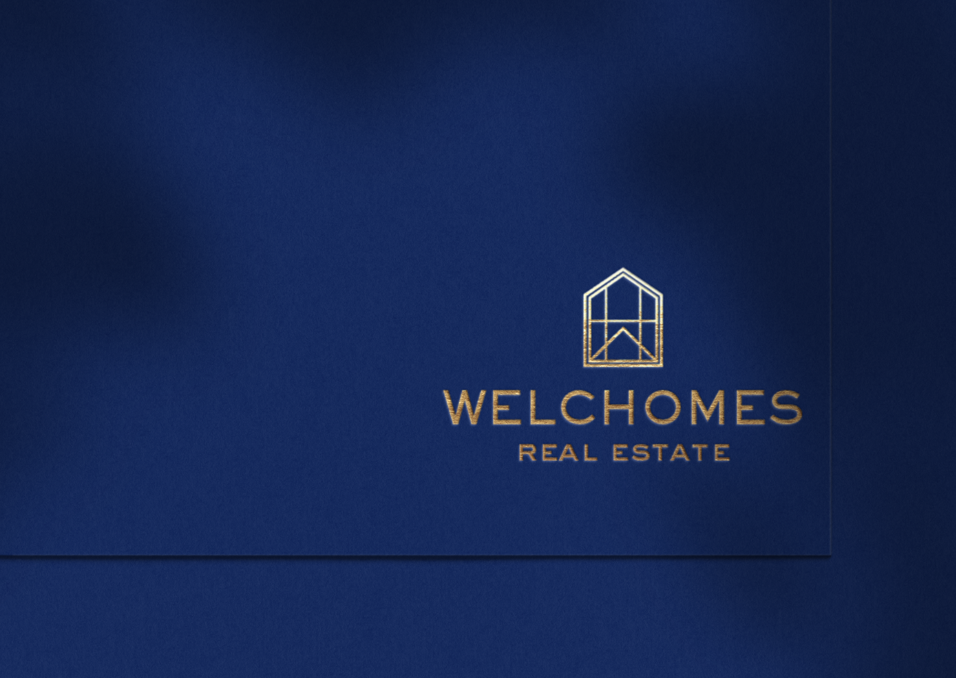
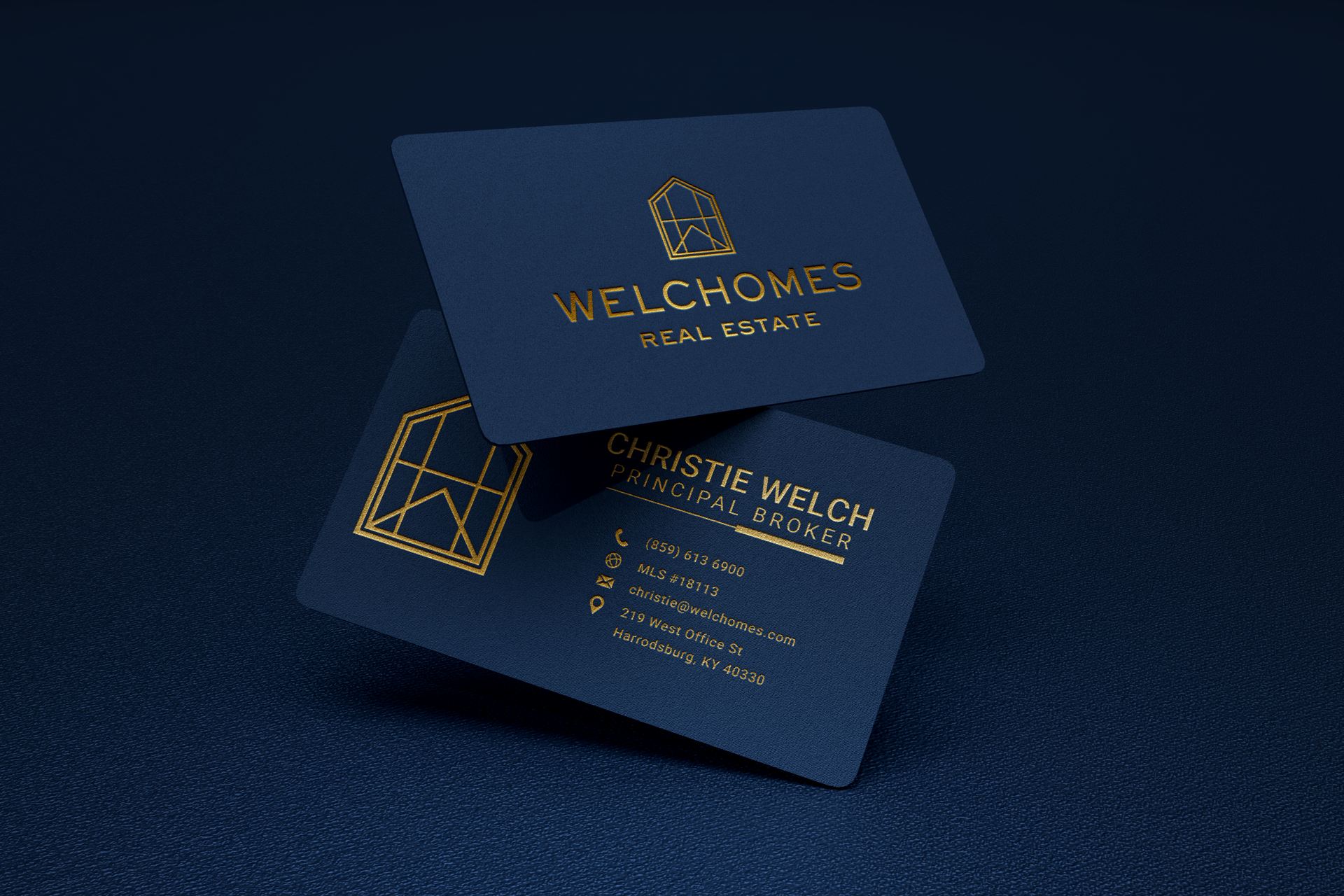
Logo Design & Business Cards
Welchomes
Needing to imbue a personal touch to your brand and business? Creekmore Marketing helped this client do just that.
Design Insight
We wanted to incorporate the founders initials into the business icon within the design while still keeping the structure of a home. Using thin, crisp moodlines, we incorporated the letter "W" and "H". These letters hold up the structure of the home as well as create a door and window within the center of the shape. Not only do these overlapping lines provide intrigue, they also provide movement and dynamism as well. We want potential home buyers to know that you’re forward thinking and progressive, using new strategies and technology to help them in their search. These lines create that motion, bringing your eyes up through the design and leaving them feeling like this motion and height upwards is aspiring.
To give the icon more structure, we integrated thin modern lines encasing the central icon within a second home outline. This adds weight and grounds the shape. The principal of grounding makes the viewer feel like everything is going to be okay - it’s a very trustworthy feeling. Encasing the central icon leaves the viewer feeling very secure and enveloped, which is warm, reassuring, calm, and again reinforces trust. Overall, the design is very modern and sophisticated, without leaving the viewer feeling that you are too high end or exclusionary. The overall composition infers quality, attention to detail, trust and honesty due to it’s openness in the center of the shape.