Logo Design & Rebrand
The Fly Witches
Rebranding is a strategic move that can breathe new life into a company's identity, and one of the most impactful elements in this process is updating the logo. A logo serves as the visual ambassador of a brand, representing its values, personality, and overall identity.
Design Insight
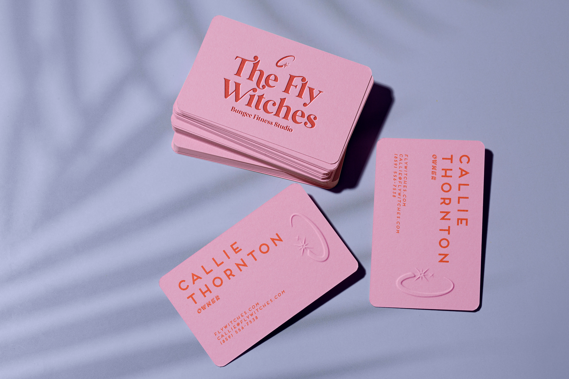
When The Fly Witches Bungee Fitness Studio came to Creekmore Marketing in search of a rebrand and new logo identity, we first sat down and did an in-depth exploratory call to better understand their past, present, and what they wanted for their future.
They wanted to stray from leaning into their "witchy" vibe of the past while still incorporating their old color palette. Ultimately, it was decided that we'd incorporate a fun, modern font with a clean, inviting, and inspiring icon. Going beyond mere aesthetics, they wanted their new logo to make new and existing clients feel apart of a community that made magic happen in the studio through the transformation and empowerment of a fit, healthy body.
The two stars represent the founder and co-founder on their professional and fitness journey, which was a purposeful call back to their very first logo which featured avatars of the two of them together. At Creekmore, we strive to incorporate these personal touches within the overall design, while delivering the best possible graphic identity based on the company's goals.